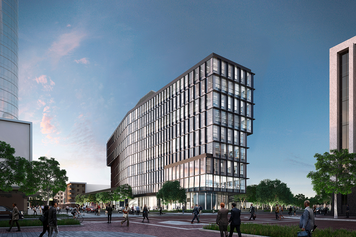
Deborah Berke’s first office building receives rave reviews for bringing the art of architecture to everyday life.
“While the office building can be accused of indulging the current architectural fashion for stacked boxes, its form actually derives from three rational imperatives: provide a light-filled work environment, reduce energy consumption, and continue Cummins’s tradition of distinguished modern architecture. A sun-and-energy study prepared by Atelier Ten in cooperation with Berke’s firm led to a tower of shifting floor plans whose overhangs create dynamic massing and provide sun-shading. Vertical fins and brises-soleil offer more protection from the sun as well as rich textures and visual rhythms. The sun-shading elements vary not only from facade to facade, but within a facade, based on the position of the sun and the interior function of the space behind the glass. The exterior ‘is calibrated in terms of performance and syncopated in terms of aesthetics,’ Berke says, explaining that Cummins’s precision-oriented engineers embraced the notion of calibration. Her narrow floor plates enable daylight to penetrate deep into the interior of the post-tensioned concrete structure and further reduce the need for electric illumination. The design is projected to cut peak cooling loads by 10 percent, she says.
Just as the building engages the city around it, so it bids Cummins’s employees to interact with each other. That communitarian impulse is evident in a streetlike second-floor corridor that gathers workers coming into the building from the garage with those who ascend a dramatic staircase from the generously proportioned lobby. The design, as Berke says, creates ‘a moment in the building where people all come together in one place.'” – Blair Kamin, Architectural Record
Read more ↓
Cummins Tower by Deborah Berke Partners, Architectural Record