Were the greatest accomplishments at Ground Zero economic, architectural, or urban?
It's the streets!
Greenwich Street
Vents, water, power and sustainability

Photos courtesy of Peter Walker Partners Landscape Architecture.
Editor’s Note: Urban design was charged with elevated responsibility as the towers tragically fell on September 11, 2001. Among the conflicts of rebuilding New York’s reputation and economy after the catastrophe, the most urgent question that emerged concerned the organization of urban space: how to respect the memory of the towers and those victimized that day through the relationships of open spaces, building footprints, and street traffic. Urbanists would eventually carve through the superblocks that eschewed the city’s historic grid, soften the mid-century modernism championed by Minoru Yamasaki but beloved by few, and pierce through former footprints to build a memorial worthy of the occasion.
For this month’s Roll Call, we consider: Did urban design live up to its newfound expectations? Were the greatest accomplishments at Ground Zero economic, architectural, or urban? What were the blunders we might have avoided? We approached three Fellows of the Forum who were intimately involved in rebuilding Ground Zero—Peter Walker, Alex Garvin, and Vishaan Chakrabarti—to reflect on decision-making over a decade of reconstruction in Lower Manhattan. –DM
It's the streets!
Progress at WTC? It’s the streets!
Without question, the most successful decision in the urban design process for the World Trade Center site was the most difficult to achieve—the re-introduction of the street grid. Standing today on Greenwich Street between Fulton and Liberty, at the nexus of TriBeCa and the burgeoning residential neighborhood to the south, one is reminded of the resonance of the most fundamental building block we have as a physical city, our streets. It is a powerful experience, and it is thrilling to know it will soon be a public experience. The fight to create the streets was long and untoward, led by a brilliantly coordinated move by the City, LMDC, SOM, and Silverstein Properties to reconfigure 7 WTC – downtown’s most beautiful recent office building – to allow for Greenwich to reconnect. The fight continued with east-west streets, particularly Fulton, to bring a newly residential financial district westward, ultimately to the Hudson. The character of Dey and Cortlandt Streets remains uncertain… while agreements exist to keep them open, and I among many fought to keep them so, it’s unclear what their experience will yield as they slope furiously towards the water, and form the new canyons of Lower Manhattan between soaring new buildings.

Problems at WTC? It’s the camel!
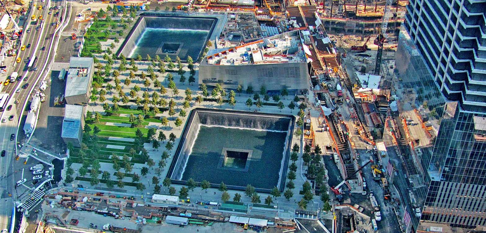
It is famously said that a camel is a horse designed by committee. The examples of this at the site are all too prevalent, but the most glaring is the visitors’ center designed by Snohetta. This normally brilliant architecture firm was put in an impossible position, designing a building with the wrong program in the wrong location for the wrong time. The only true purpose this building serves is to shield all the magnetometers from the rain, as visitors troop through the center and must have their bags and bodies examined. But even this mundane program could have been better located, in a building to the southwest of the site, which could have engulfed the mammoth concrete PATH ventilation structures that now loom over West St. (The much-trumpted “Champs Elysees” of Lower Manhattan!) Instead, the folly dominates the corner of Fulton and Greenwich, declaring itself where silence would have been the better sound. It’s presence almost robs Arad’s memorial of its power, allowing views of the footprints that it shouldn’t, while using the architectural vocabulary of 90’s Libeskind no less literally than Gehry does of Utzon.
The examples of design by committee are omnipresent: the replacement of inexpensive but beautiful jet mist stone at the base of the footprints with concrete; the inclusion of a cooling system behind the bronze plaques of the victim’s names, all so some lawyer could sleep easy in an expensive bed; the cheapening of the base of One World Trade Center. All of these moves make us question whether we, as a society, can achieve greatness at scale.
But in the end, there will be the streets. And with the streets, come the City, and with the City comes its ultimate promise, the unknown.
Greenwich Street

The most significant achievement in the reconstruction of the World Trade Center has been the re-creation of Greenwich Street as an artery running through the site, re-connecting Tribeca directly with the financial district. Security considerations may initially restrict vehicular traffic passing through this rebuilt World Trade Center.
A century from now, however, all the buildings on the redevelopment site will have become fully integrated with the rest of lowerManhattan and Greenwich Street and its main artery will be filled with the trucks, buses, taxis, private automobiles and pedestrians that were once excluded from the site.
The most regrettable decision over the past decade has been the expenditure of over $21 billion in public funds without any public accounting or public participation in the decision-making process since the adoption of the Libeskind Plan in February 2003.
Vents, water, power and sustainability
 We had to make many difficult decisions about the Memorial, difficult because the project has been so complicated and so contentious. On the positive side three issues come to mind, all of which have resulted in improvements that a visitor to the memorial will probably never be aware of.
Vents: The memorial sits on top of the equivalent of a seven-story building that includes a parking garage, a chiller plant, a shopping center, and a museum. Calatrava’s station sits under the northeast corner, connected to eleven subway lines. All of these uses require air intakes and exhaust vents. At first the engineers said they required seventeen vents, and the vents had to be forty-feet high—up in the trees—because someone might throw a bomb down them. We tried to negotiate, but the engineers and the security people were adamant. So we made a model in our office, and we put all the vents in the proposed positions, and we painted them orange. This is what we now call the “awful model.” We took this to Governor Pataki, and I told him what was happening, and he said, “That looks awful.” He turned to the engineers from the Port Authority, and he said that we couldn’t have any of those things, that they were not acceptable. The engineers said that maybe they could eliminate one or two and maybe we could “decorate” the rest. And the governor said no, we couldn’t have any of them at all. This decision required rerouting exhaust- and intake-systems across the seven-story area below the plaza and putting them all into two structures over on the west side. And so the vent structures on the west side of the park were born, and the flat plaza of the memorial was preserved.
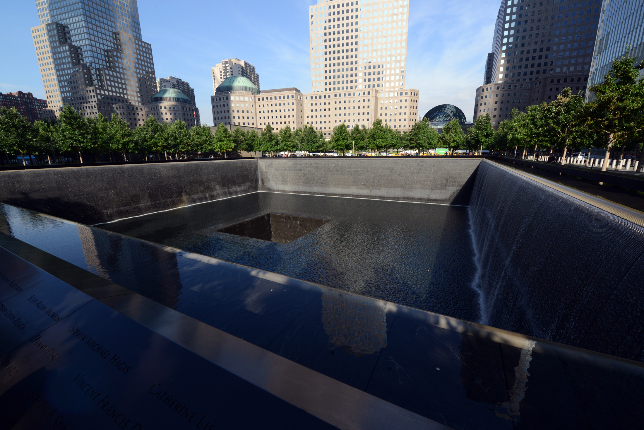
Water and power: The fountains in the voids posed a greater design problem than expected. For an even flow across the weir a waterfall requires about a half inch to an inch of water. This means that the huge fountains of the voids would require many gallons of water to fall across the weir. Of course when it was falling, the water would use no energy, but it would have to be pumped back up to go across the weir again, and the electricity to pump this enormous amount of water would cost many millions of dollars a year, really an incredible amount. We had done a number of waterfalls and we had always worked with our fountain consultant Dan Euser. Now Dan figured out that you could put a series of tooth elements on the memorial weir, like a comb, so that as the water fell it would change from a sheet of water to a series of small water falls, thousands of small water streams that would look very much like a regular waterfall, but use less than half the amount of water and therefore reduce the operating cost by a substantial amount. This was a huge contribution. It kept the waterfalls from being economically unfeasible. Dan was really a hero. He built a full-scale mock-up in his backyard in Toronto and proved that this system would work.
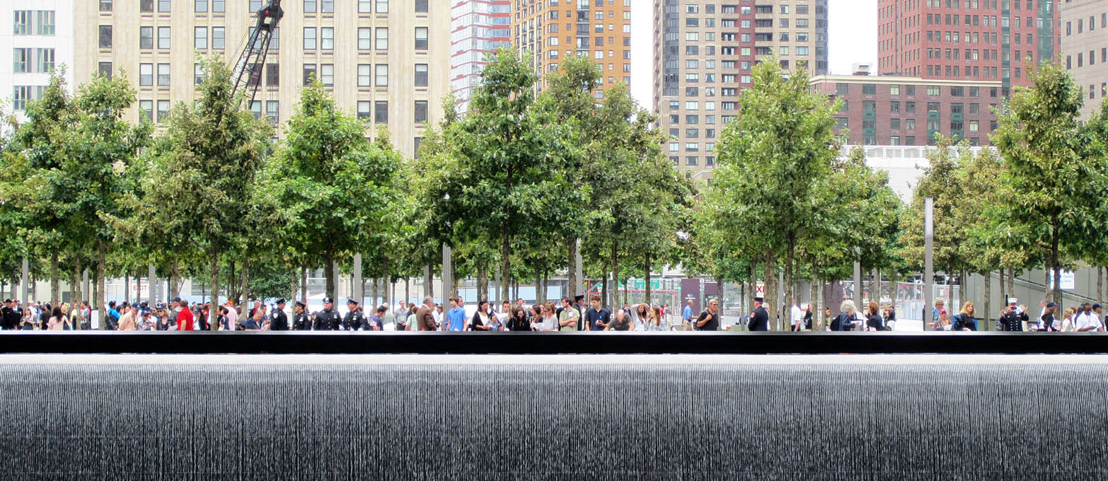
Sustainability: Another reason trees last such a short time in New York City is that they are usually planted in a hole in hard-packed soil. For trees this is like putting down roots in a concrete box. Even if they don’t fall over and die or defoliate, they don’t grow very well. We wanted to make a setting for the trees that would encourage their growth and health. Trees not only take in food through their roots; they also take in air. So we designed a engineered soil with thousands of small air spaces that help the roots grow. And we planted the trees not just in boxes but in long trenches that run across the memorial from east to west and give the trees enough soil to grow and to thrive within the City. We also designed a series of drains that go completely across the memorial east to west. Those drains catch every drop of rain water and snow melt that falls on the plaza. The water is taken down below the seven stories and stored in two 150,000-gallon tanks, one for the north void, one for the south. Collection takes place in the rainy season; then in the dry season that water is pumped back up and used for irrigation of the trees, grass, and ground cover. This system creates a sustainable cycle, probably the largest mechanical sustainable system ever built in New York City.
If I have one regret it is the removal of the liquidambar trees. They were to surround the glade where people will gather to read the names every September 11. Unlike the swamp white oaks in the rest of the plaza, the liquidambars would have turned red by that date every year, suggesting a natural parallel to human emotion. They were removed because the architect felt that they competed for attention with the voids that mark the locations of the World Trade Center towers. We thought they were entirely different, natural elements reminding us of the cycles of death and rebirth.