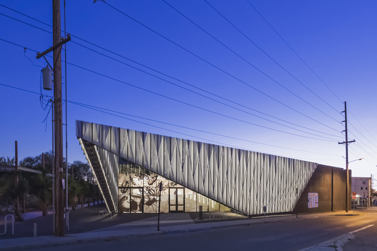
Christopher Sharples’s design of SITE Santa Fe matches the gritty context of the neighborhood and improves the display of the gallery’s contemporary art.
‘Its most prominent feature is a “prow” of perforated metal panels angled toward a busy intersection. The prow frames the building’s new glass front, which replaced an opaque stucco wall. “It used to be you could stand outside and not know what was happening inside,” says Hofmann of the once-windowless building. Now form advertises function.
For Christopher Sharples, the SHoP principal who led the project, part of the inspiration was SITE’s site. The building parallels a park designed by architect Frederic Schwartz and landscape architect Ken Smith that opened in 2008. Like the surrounding district of former warehouse buildings, the park—with detailing much like that of New York’s High Line—“has a grittiness and attitude,” says Sharples, “and we didn’t shy away from reflecting that in the new building.” He adds, “The park and the building are symbiotic.”’ – Fred A. Bernstein, Architectural Digest
Read more ↓
SHoP Architects Unveils a Game-Changing New Landmark in Santa Fe, Architectural Digest